Progress Bar
A progress bar is a visual indicator used to represent the completion level of a task or process. It commonly appears as a horizontal (sometimes vertical) bar that fills up to convey how much of an operation is finished—like uploading a file, completing a form, or loading a page. Progress bars offer real-time feedback, helping users gauge the remaining time or effort required.
Usage
Show Ongoing Tasks: Whenever an action or operation (loading, uploading, processing) might take time, a progress bar helps users understand how far along it is.
Provide Feedback: When users initiate something that isn’t instantaneous, a progress bar reassures them that the system is working.
Any Measurable Completion: Whether it’s a percentage-based task or a series of steps, progress bars can visually map the progress.
Use cases
Upload or download status (e.g., showing 40% complete)
Installation wizards or software update progress
Multi-step processes, like form completion or checkout flow
Not to be confused with
Spinner: A spinner typically indicates an ongoing task with no definable progress (just shows something is happening). A progress bar reflects a known or estimated completion percentage.
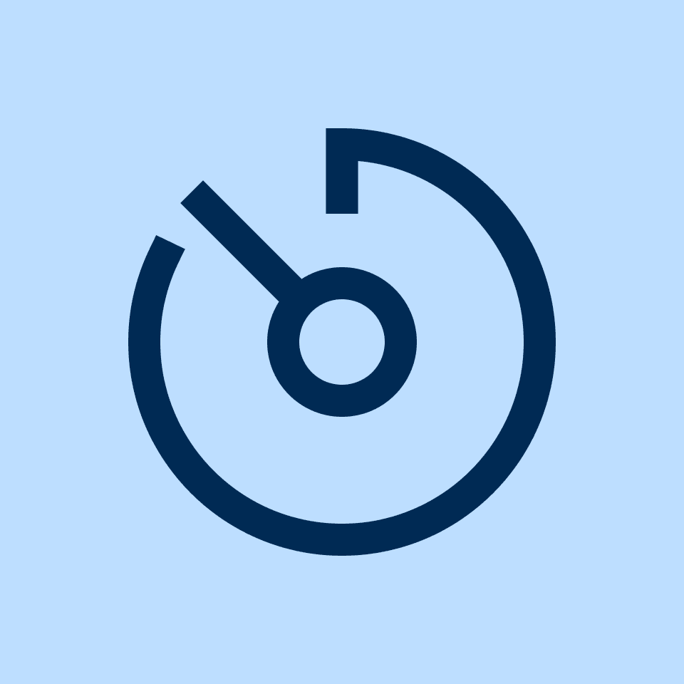
Gauge: A gauge is a circular or radial representation of a single value against a range. A progress bar is usually linear and focused on depicting task completion.
Stepper: A stepper breaks a process into discrete steps. A progress bar might show an overall percentage, while a stepper specifically identifies which step the user is on out of a sequence.
Skeleton Loading: Skeleton placeholders indicate where content will appear in the UI while loading. A progress bar specifically tracks the portion of completion.
Best practices
Show Accurate Progress
If you can calculate or estimate completion time, reflect that in the bar.
For tasks that fluctuate (e.g., network-based file uploads), update regularly to stay accurate.
Consider Indeterminate State
If you can’t determine the time or progress, use an indeterminate progress bar (often an animated stripe or a “looping” bar).
Switch to a determinate bar once you have a solid estimate.
Label or Percentage
Show a numeric percentage or descriptive label (“50% complete,” “2 of 5 tasks done”) if it helps users.
Alternatively, keep the bar minimal if that best fits the UI.
Visual Contrast & Clarity
Use distinct colors and adequate contrast for the filled vs. unfilled segments of the bar.
The progress should be clearly visible in both light and dark modes, if applicable.
Provide Feedback on Completion
Once the task is done, consider showing a success message or changing the bar color.
If the process fails, indicate that with an error state or relevant message.
Placement & Context
Place the progress bar near the relevant task or content, so users associate it with the action they initiated.
In multi-step forms, a horizontal bar at the top often works well.
Accessibility
Ensure the bar or its label can be announced by screen readers (e.g., role="progressbar" and aria-valuenow, aria-valuemin, aria-valuemax).
Convey progress numerically (e.g., “50% completed”) so those with visual impairments can follow along.
Performance Considerations
Update the bar at logical intervals (e.g., a file upload’s network callbacks) rather than too frequently.
Avoid janky animations or CPU-heavy rendering on slower devices.
If the exact progress can’t be measured (e.g., unknown completion time), consider an indeterminate progress bar or a spinner.
Summary
A progress bar offers a clear, linear representation of task completion, helping users understand how much of a process remains. By providing accurate or estimated progress (or indicating an indeterminate state if you can’t measure progress precisely), plus clear labeling and accessible properties, progress bars build user trust and reduce anxiety. Thoughtful placement, contrasting visuals, and timely feedback enhance the user experience, whether for uploads, installations, or multi-step workflows.